
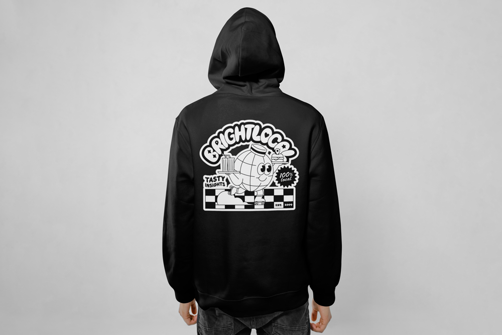
BRIGHTLOCAL
Leading a complete product design transformation for the world's third-largest local SEO platform, bridging the gap between brand and product, building a design system from scratch, scaling the UX team, and designing AI-powered features that turned complex data into clear, prioritised actions.
£10M → £20M
annual revenue
2% → 9%
week-one retention
28% activation improvement
NPS 26 → 58 customer satisfaction
THE PROBLEM
Beautiful marketing, broken product
When I joined BrightLocal as Creative Director, the company had stagnated. Revenue had plateaued at around £10M for two years. Tens of thousands of people were signing up for a free trial every week, but only around 2% came back on day two.
The product experience was the problem. The platform had been built over 10 years across three separate codebases stitched together by engineering. There was no onboarding flow, no home dashboard, no design system, and no product design principles. Users signed up, were dumped into the tool, and were expected to figure it out by watching 15-20 minute tutorial videos. Most didn't bother.
The disconnect between brand and product was making it worse. The marketing and website looked polished and modern. When users landed in the product, it looked like a completely different company. The UI felt dated, inconsistent, and complicated. Users reported feeling misled, and that distrust was directly driving churn.

DISCOVERY
Three groups, three very different stories
Before designing anything, I needed to understand the full picture. I started by meeting every department head: CEO, CTO, CMO, Head of Sales, Customer Success. I mapped how the business worked, where the friction points were, and what each team believed was causing the stagnation.
Then I pushed the company to run their first ever customer survey, sent to tens of thousands of existing users. Alongside this, I set up three distinct focus groups through the customer success team:
Active users who were still paying and using the tool. Users who had subscribed but churned and didn't renew. Users who signed up for the free trial but never converted to paid.
We offered £50 Amazon vouchers for participation, and the insights from these three groups shaped every product design decision that followed.
What the research told us
Three findings emerged clearly across every research group.
First, the brand-to-product trust gap. Users consistently said that what they saw in marketing didn't match what they experienced in the product. The disconnect was so severe that it was actively damaging trust and driving people away before they even tried the tools.
Second, no guidance. Users were dumped into the product with no onboarding, no dashboard, no sense of where to start. The only help was tooltip paragraphs and long tutorial videos. If you need to study to use a tool, the tool isn't doing its job.
Third, no differentiation. I ran an exercise where I removed all logos from 15 competitor landing pages and asked BrightLocal employees to identify their own website. Most couldn't. The product looked and felt like everyone else in the market. The two competitors succeeding (SEMrush and Yext) had distinct brand and product presence. BrightLocal had neither.
PRODUCT DESIGN STRATEGY
Principles first, pixels second
The first thing I did was establish product design principles. There were none. No North Star for quality, no shared definition of what good looked like, no alignment between brand values and product experience. Designers were making independent decisions with nothing to calibrate against.
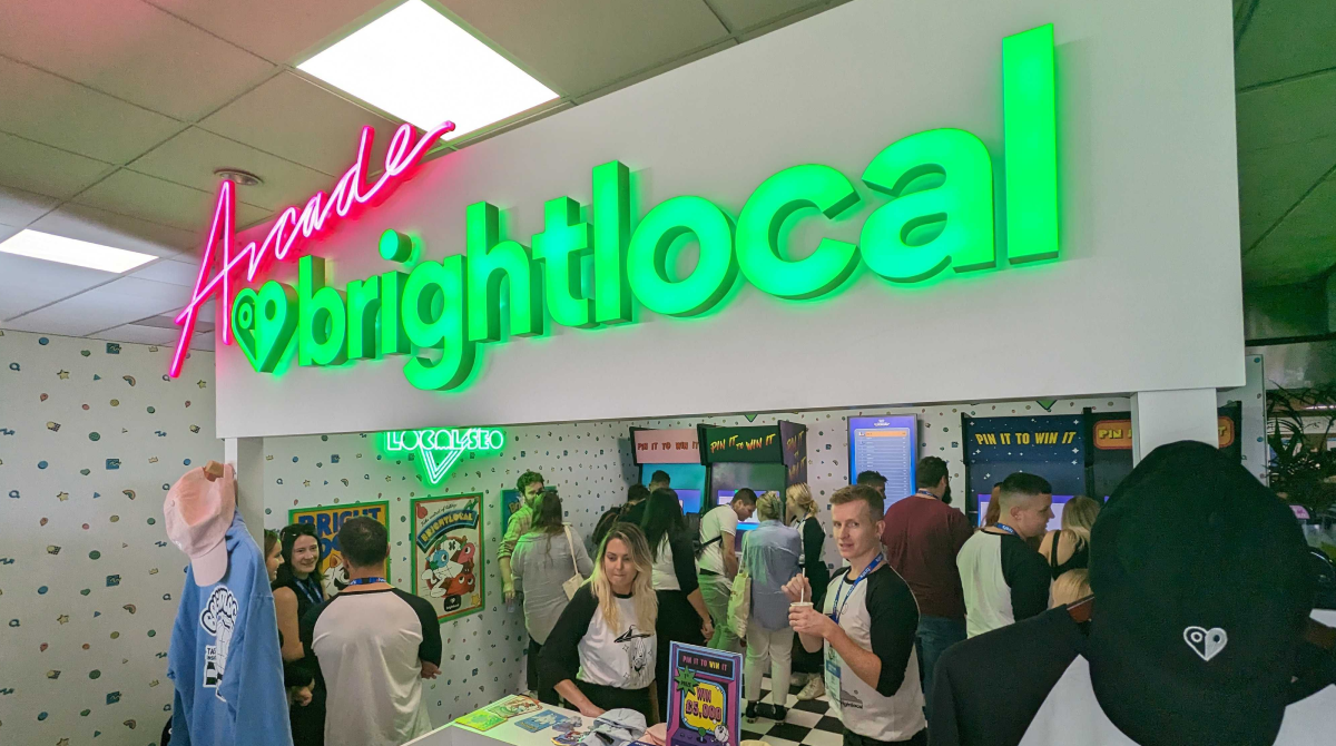
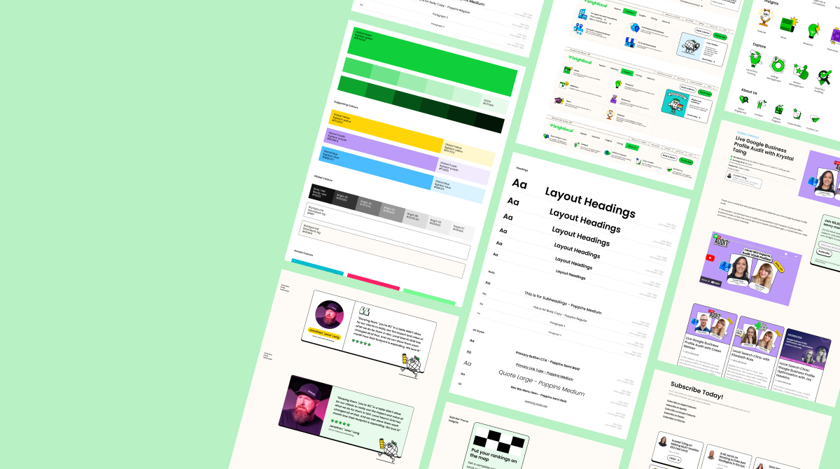
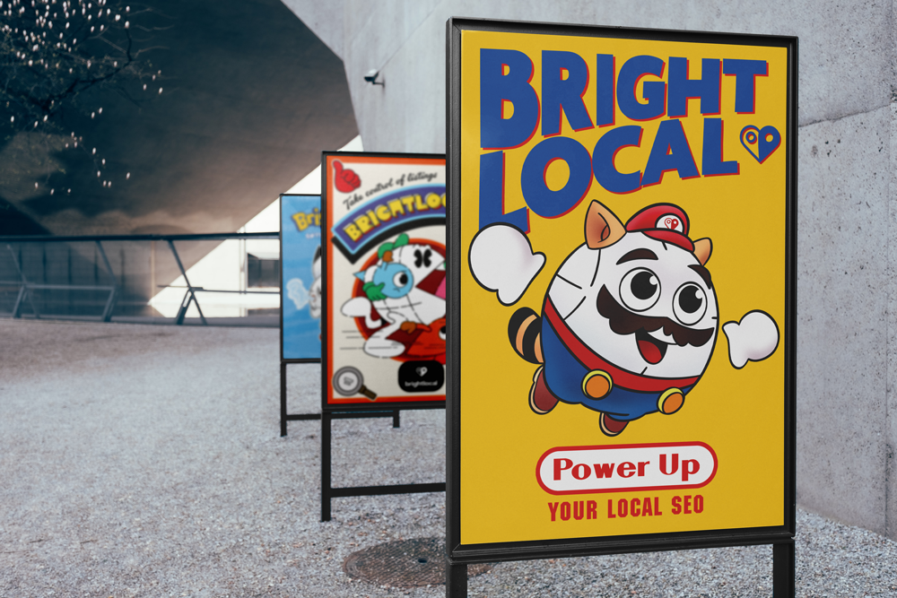
We defined principles together across brand and product: delight customers, make it intuitive (no one should need to read paragraphs or watch videos to use a feature), and be visually distinct from competitors. We likened BrightLocal to a skate brand meets local SEO company: independent, welcoming, a bit of an upstart, based in Brighton. That personality needed to show up in the product, not just the marketing.
Critically, we didn't design the brand identity separately and then adapt it for product. We built them cohesively. What does the brand look like? How does that brand play out inside the product? The design system, the illustration style, even the brand mascot that became a companion character inside the tool, all designed as one connected system from the start.


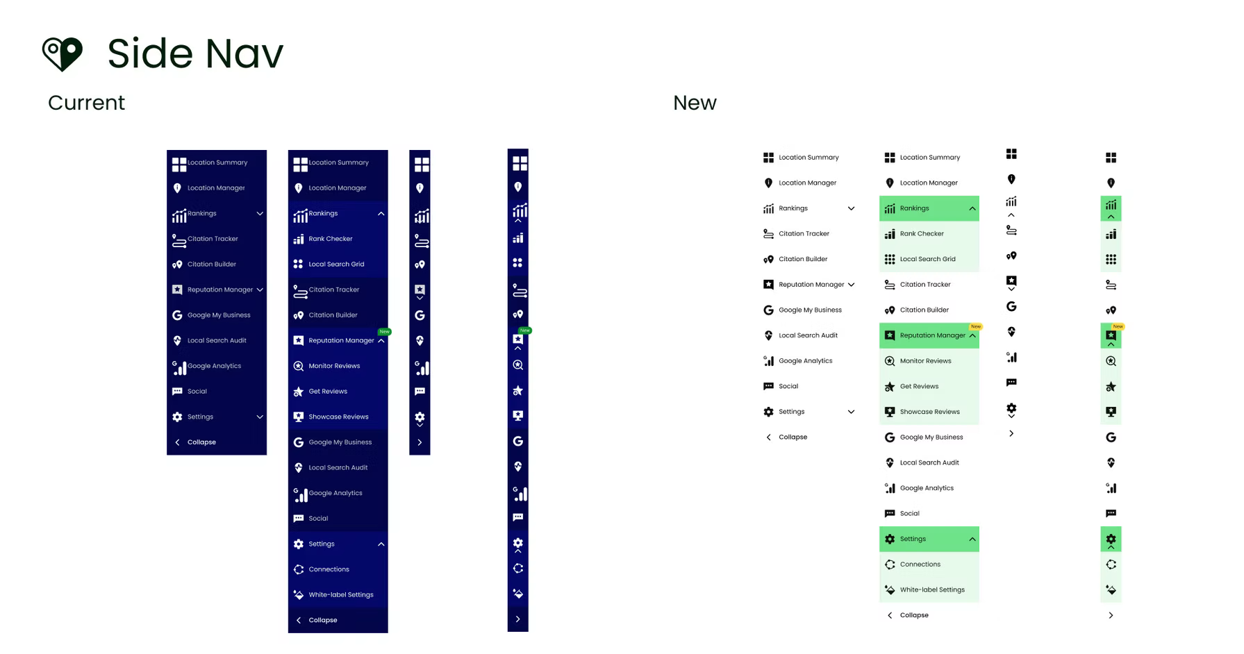
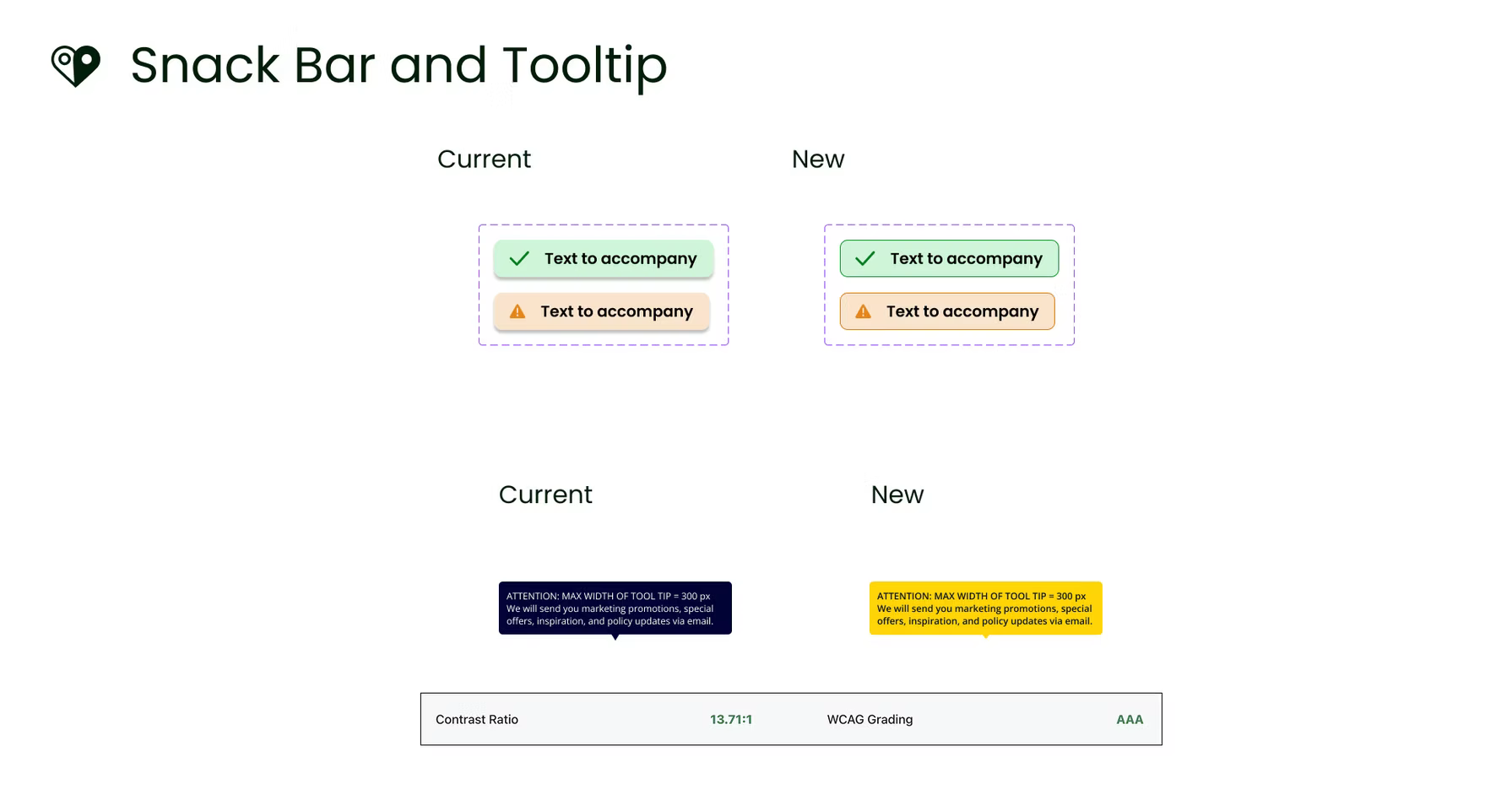
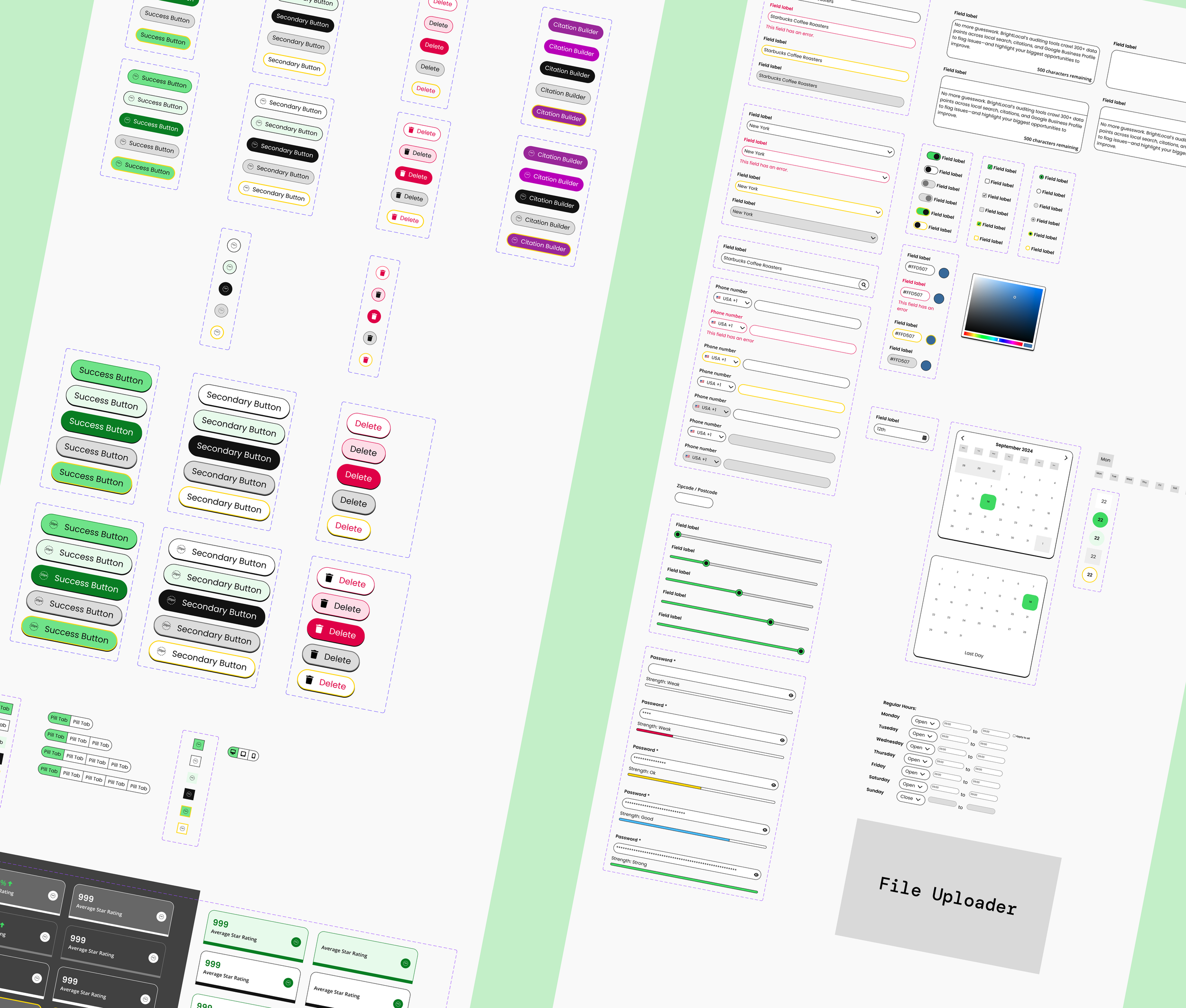
DESIGN SYSTEM
One system to replace three codebases
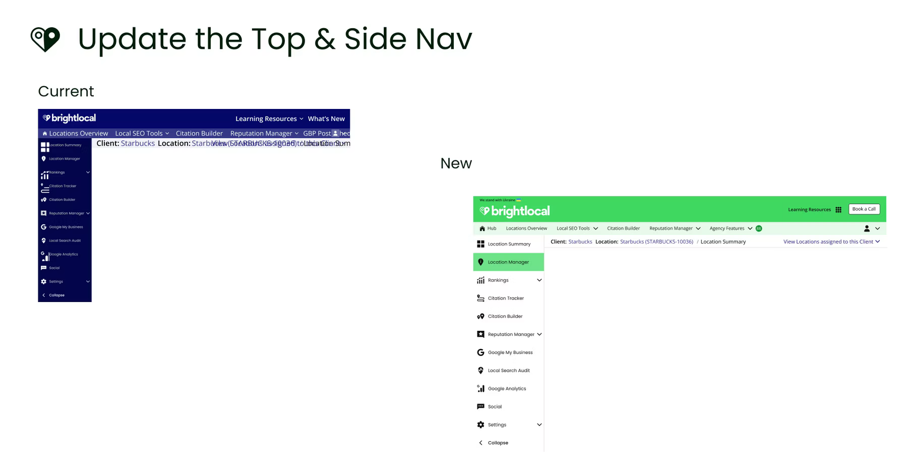
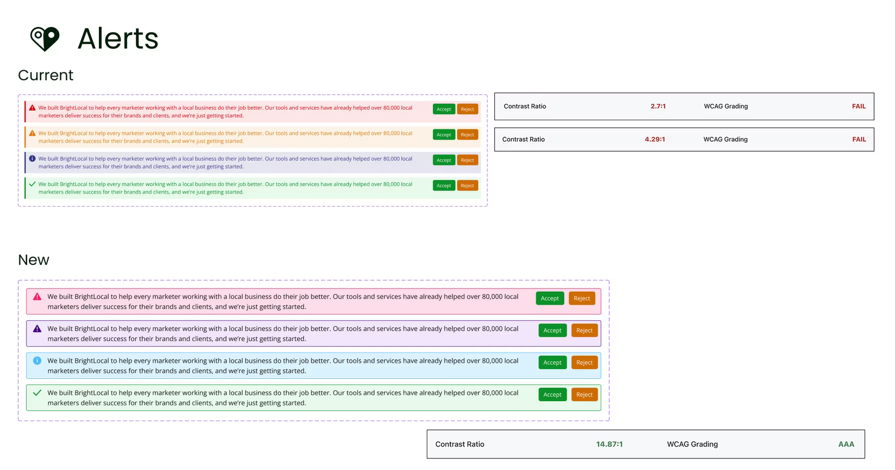
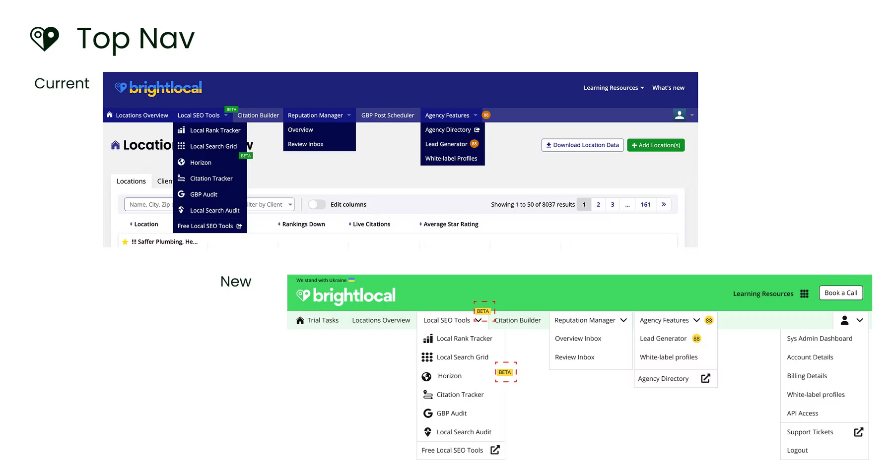
The old product was built on three separate platforms stitched together. Every time a new feature was added, it looked slightly different from the last because there was no shared component library. The visual inconsistency compounded over a decade of uncoordinated feature development.
I led the creation of a completely new design system from scratch, built around our brand principles. Components, typography, colour, spacing, interaction patterns, and motion, all designed to be distinct from competitors and consistent across every tool in the platform. If someone saw a screenshot of BrightLocal on a colleague's laptop, we wanted them to immediately know what product it was.
The design system also solved an operational problem. Before it existed, there was no way to quickly build and test prototypes. The company had spent three years building a product that no one wanted because they had no mechanism to validate ideas before committing engineering time. The design system gave us the foundation to prototype, test, and validate at speed.

ONBOARDING
From "dumped into the tool" to guided value
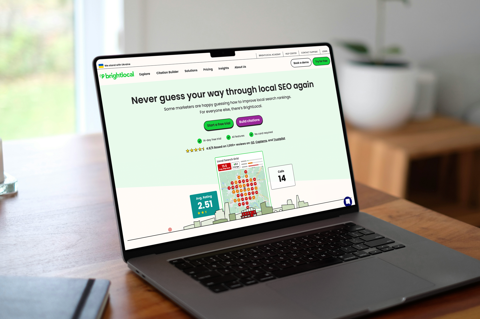
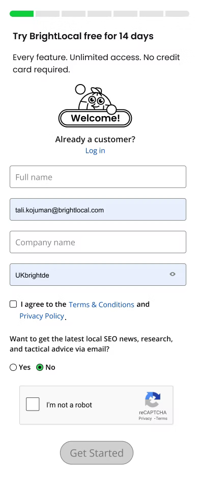
The old experience: sign up, answer a series of questions, land in the product with no dashboard, no guidance, no live data. Figure it out yourself or watch videos.
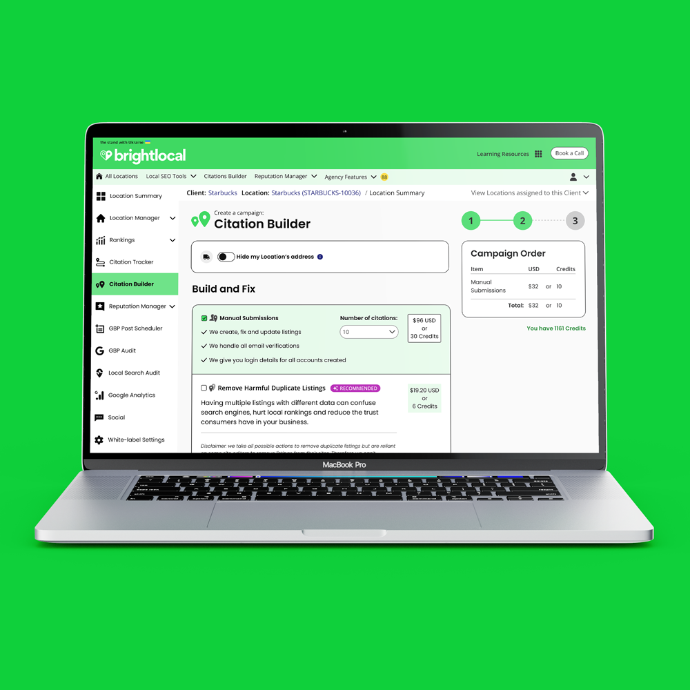
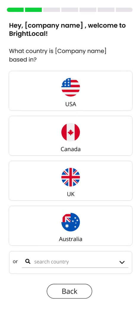
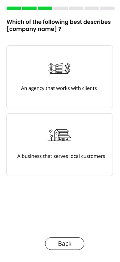
The new experience: during signup, users add their first business location. By the time they land in the product, live data is already populating. They immediately see value. The new dashboard presents a series of task cards, gamifying the setup process. Complete a task, get a celebratory moment. Connect your Google Business Profile, your Bing profile, run your first report, each step earning a dopamine hit of progress.
The gamified approach solved two problems at once. It taught users how the platform worked without requiring them to watch videos or read documentation. And it got them to a moment of genuine value (seeing their own data, understanding their local SEO position) within minutes, not days.
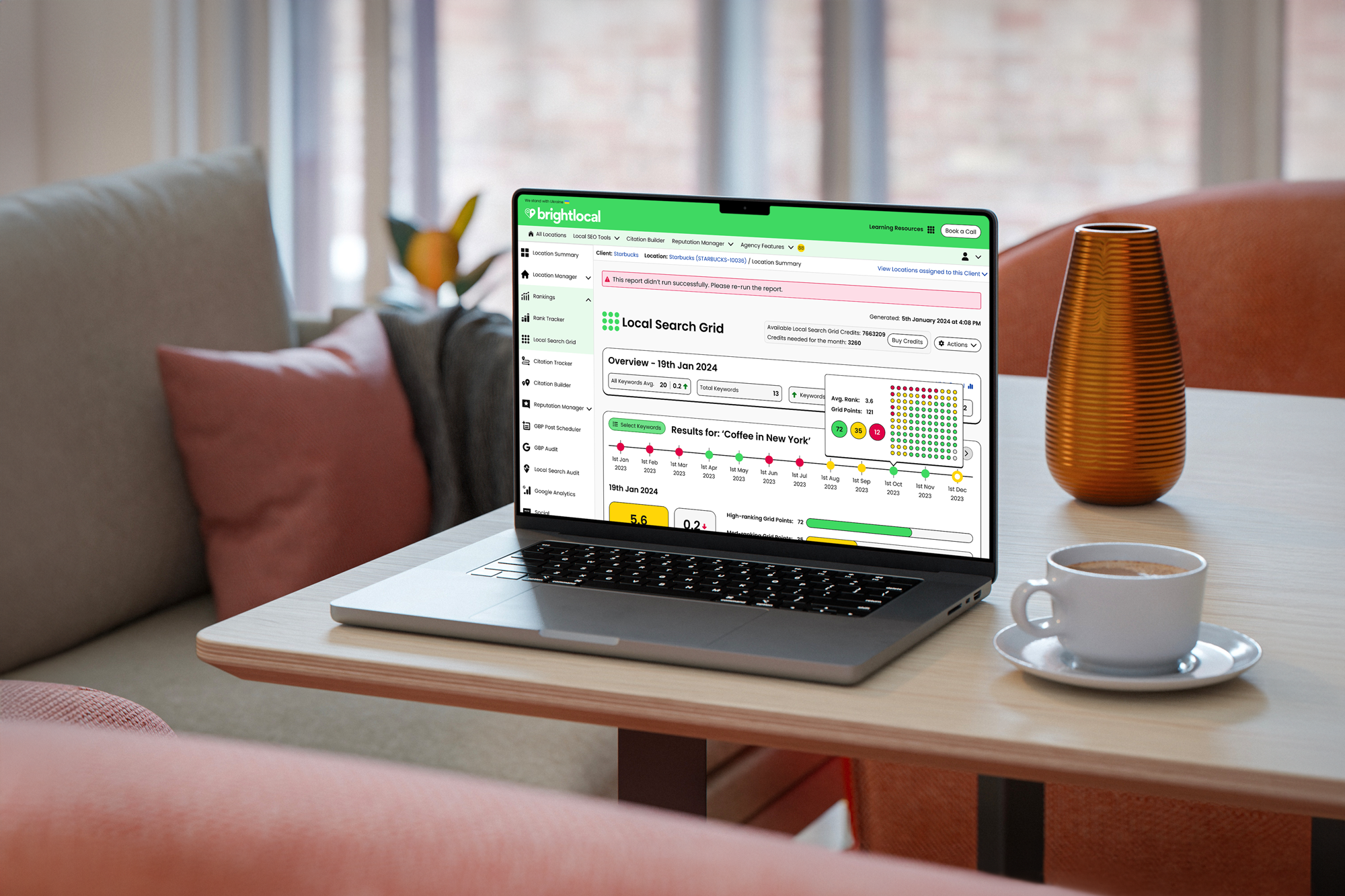
SIMPLIFYING COMPLEXITY
Three levels of data, one clear hierarchy
BrightLocal's tools were drowning in data tables. Every feature presented everything at once, requiring users to wade through dense information to find what mattered. I introduced a three-tier information architecture approach, drawn from my experience designing data-heavy platforms in sports:
Level one: the headline. When you land on any tool, you see the key insight immediately. Here's a problem, here's what the data says, fix it. One clear action.
Level two: the detail. Click deeper and you get more context, what's driving the issue, how it compares over time, what the options are.
Level three: the deep dive. For power users who want to export CSVs, cross-reference data points, and run their own analysis.
This tiered approach meant a small business owner and a data-obsessed SEO agency could both use the same tool effectively, just at different depths. We also stripped the navigation from a confusing double-nav (top and sidebar, often contradicting each other) down to a single, clear navigation system.
AI FEATURES
AI that turns data into direction
As AI became the industry expectation, the pressure was to add it everywhere. My approach was different: AI should enhance the product experience, not add more bloat. We didn't want a ChatGPT box bolted on. We wanted AI embedded into the platform, working with user data to surface genuine value.
AI Insights analysed data at location level and surfaced what mattered as clear, prioritised actions. Instead of users manually running reports and interpreting complex SEO data, the dashboard told them: here's a broken citation, here's an out-of-date listing, here's a trend in your traffic — with a single click to fix each one. It removed hours of analysis and gave users prioritised actions ranked by impact and ease. Clear recommendations in plain English, no jargon.
AI Review Response solved a different problem. Small business owners often don't know what to write when replying to customer reviews, and slow responses to negative reviews can escalate quickly. The tool read incoming reviews, understood the business context, and either auto-responded (for time-critical negative reviews, especially overnight) or provided recommended response options the user could send with a single click. At enterprise level, managing hundreds of locations, this cut hours of work down to minutes.
AI Visibility Optimisation tracked presence in Google AI Overviews and ChatGPT, showing visibility, sentiment, and share of voice, plus clear actions to improve. Helping users show up when people search local SEO through AI tools.
TEAM & CULTURE
Fewer PMs, more designers
When I joined, the UX team was two people: a part-time UX designer and a senior UX designer. They were servicing five product managers across five workstreams. Everything was bottlenecked through design.
I restructured the balance. As product managers left, we didn't replace them all, instead reducing PMs and significantly growing the design team. We went from 2 UX designers to 6, embedded in squads alongside engineering. Each squad had dedicated UX, UI, and visual design capability.
This shift changed the culture from engineering-led to design-led product development. Ideas were researched and validated through prototypes before reaching engineering. The design system meant prototypes could be built quickly. User testing became a standard part of every feature development cycle, not an afterthought.
The result was a team that could keep pace with engineering, validate ideas before committing build time, and ship consistently high-quality experiences without the bottleneck that had held the company back.
IMPACT
From stagnation to growth in six months
The results were visible within the first six months of implementation.
Week-one retention jumped from 2% to 9%. For a platform with tens of thousands of free trial signups every week, that single metric represented a fundamental shift in how new users experienced the product.
NPS rose from 26 to 58. Existing users were happier, new users were staying, and the platform was earning trust rather than losing it.
Annual revenue grew from approximately £10M to £20M over the course of my tenure. Getting people onto the product, showing them value immediately, and converting them to subscribers was a direct result of the product design transformation.
BrightLocal had stagnated for two years before I joined. Within six months of the redesign, the company was growing again. The design system, the onboarding, the three-tier data approach, and the AI features didn't just improve the product, they gave the company a foundation to build and iterate faster than their competitors for the first time in years.
Role: Creative Director (Design Director) - product design strategy, design system creation, UX research, team scaling, AI feature design, onboarding redesign
Team: Scaled from 4 to 16 (UX team from 2 to 6)
Tools: Figma, FigJam
Duration: 2022-2025
Status: Live, all features shipped and adopted